top of page

Catalpa
Corporate Identity, Signage System
and Do-it-yourself-brand portal.
Catalpa is a Dutch network of child care centres with over 220 highly autonomous branches operating under one main Catalpa holding.
Their goal was, to become the most fun-loving child care centre in the Netherlands.

Logo family

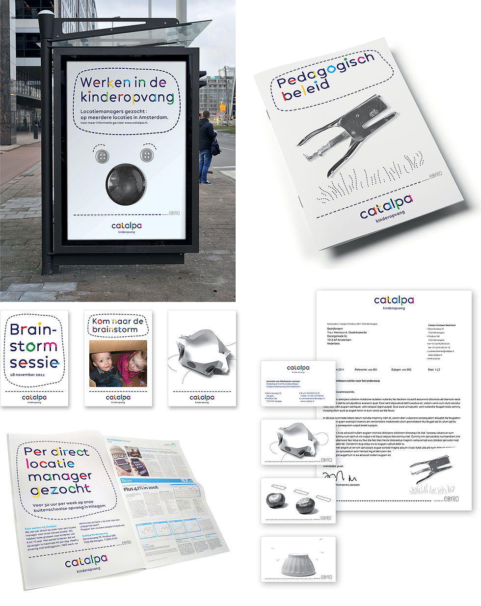
Signage

The children at work

Form language and Font family

Media of the Locations

Media of the Catalpa Holding
The Background
We were asked by Catalpa to create one strong Identity, that works for the holding as well as it respects the freedom of the more than 220 highly independent child care locations.
We came up with a basic, typography-driven Visual Identity, which was versatile and dynamic enough to allow individual child care centres to design their very own logos.
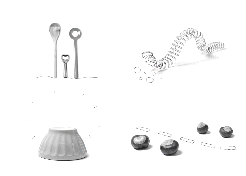
The supplementary visuals were based on a series of templates (‘semi-finished drawings and photographies’)
that the children could get creative with.
The Hholding uses the bare images and the location the
ones, that the children ‚filled in‘.
All the basic elements of the Visual Identity – font, colours, drawings and shapes – were made available on a do-it-yourself brand portal. This way any Catalpa staff member
was enabled to create their own communication resources
for their location.
The overall Identity is diverse and dynamic, yet easily recognizable as one family, one brand. It also proves, that even a large organisation can feel intimate and provide
room for personal expression.
bottom of page