top of page

NHL
Corporate Identity and Signing
Moving into an brandnew building, gave the impuls for NHL - The University of Applied Sciences of Friesland - to work on a new Corporate Identity. Becoming the University of Applied Sciences which offers the widest range of courses of any University in the Netherlands, NHL wanted an Identity that reflects their number one core value: diversity.

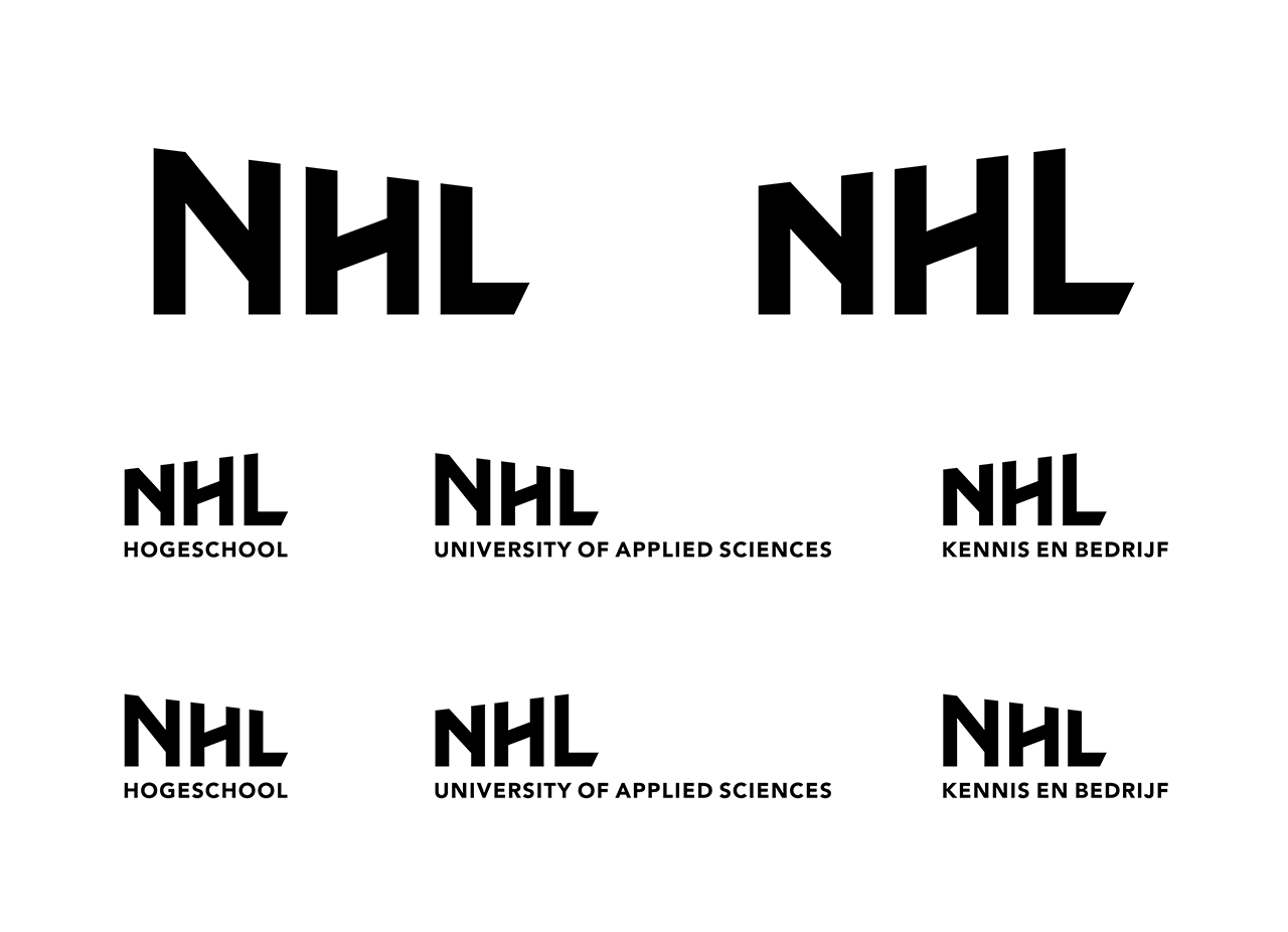
Logo family
Form family / The grid


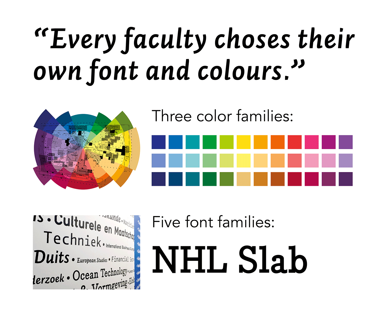
Color and font family

Student Fair

Campaign "Open Door Day"

Subbrand: Maritime Institut Willem Barentsz

The Background
With its unique angles, flexible workspaces and various areas promoting cross discipline interaction of staff and students, the newly constructed building did not resemble a traditional academic building in any way.
This was a big inspiration for us.
In our meetings with NHL, they reiterated their philosophy of ‘orchestrated chaos’.
Their iconoclastic claims that ‘Science is not blue’ and ‘Art is not red’ called for a dynamic Identity, with lots of room for adaption and participation. Students of Art and Photography classes were enabled to shoot the photos used in the Identity thru master classes, while, once a year, every faculty was allowed to chose their own colour combination and font from a broad set in order to create their own sub-Identity within the main Identity of the school.
bottom of page