top of page

NN group
Corporate Identity, illustrations and brand portal
In 2014, the ING Group wanted to rebrand and rename their insurance branch. The result was the new NN Group (previously known as Nationale Nederlanden) with the new core values: Care, Clarity and Commitment.
Brand structure

Illustration style


Typography

Brochure matrix

Photography style

Website

Infographic style

The Background
Care, Clarity and Commitment. Our goal was, to reflect those values throughout the Identity. We focussed on recognizable and bold typography that transports clear messages and a whole family of infographics - in the range of simple graphs to explanational animations-, which help in making complex or abstract content accessible and understandable.
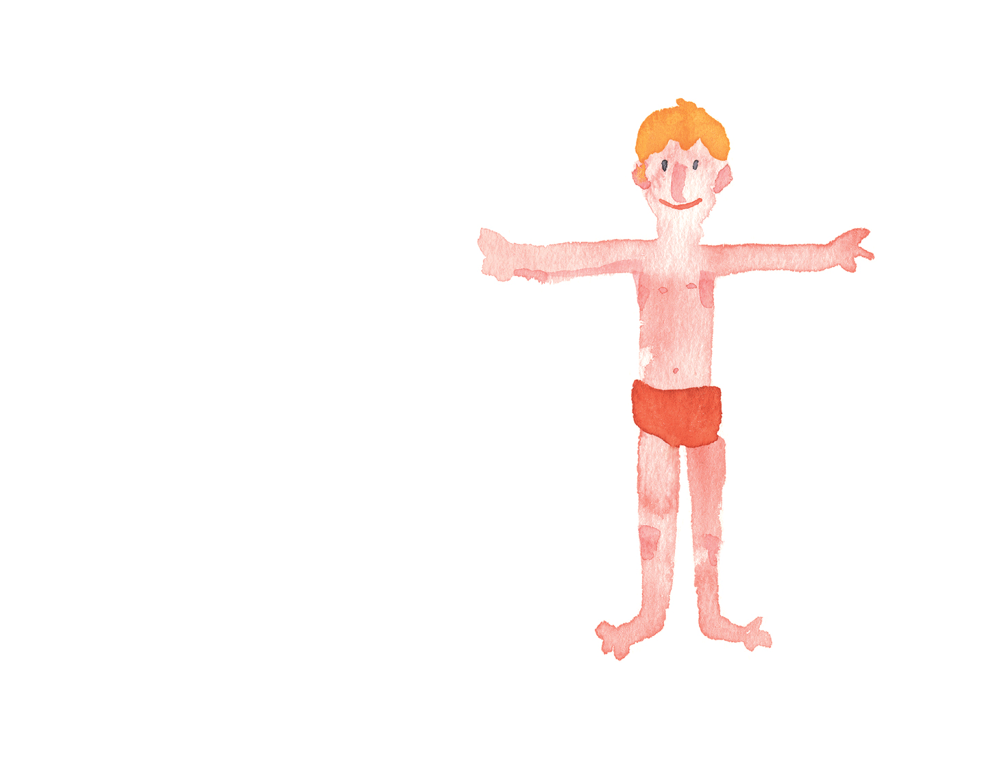
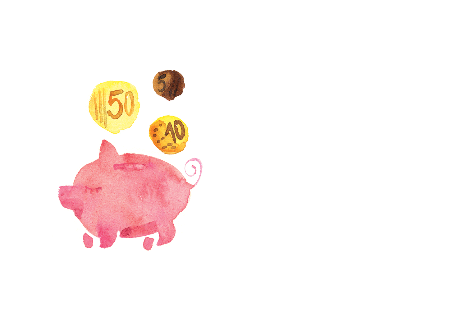
Next to an own photography style featuring situations of everyday life seen in a special light, we also developed illustrations that combine clear outlines and warm aquarell drawings. These make it possible to visualize abstract content without clichées. They also break the stereotypical codes of the world of finance and insurance by adding a very intimate and personal element to the Identity.
Since NN operates in 18 countries, building the digital NN Brand Portal was an essential step to ensure a smooth roll out of the new Identity in all local markets.
In collaboration with Menno van Waardhuizen
bottom of page